Case Study: Connect Conference
Client: Alliant Insurance Services (Employee Benefits & Mid-Market divisions)
Date: March 2019
Role: Concept & Design
Each year (when we’re not in the midst of a global pandemic), Alliant holds a producer conference. The 2018 Build Conference was a huge feat for our in-house creative team. With just 3 designers and a creative director, we were able to pull off an event that executives would call their “best conference to-date.”
After the success of the 2018 conference, the expectation for the design of the 2019 conference was even higher than the year before and thus a bigger challenge. I created the concept for the 2019 Connect conference as well as the logo, other visuals, presentations, swag, and signage.

CHALLENGE:
Create a theme and visual look for the annual producer conference that is more versatile than the previous year’s theme.
In the previous year, the conference visuals were all built around one central image and most, if not all, of the collateral looked nearly identical to one another. Because of that, from the onset, I challenged myself to create visuals that formed a more fleshed out suite of pieces that went together without looking identical.

Previous year’s Build conference theme and central image

There was very little variation in the previous year’s conference materials
One of the main goals of the conference was to bring the company’s Employee Benefits division and the Mid-Market Property & Casualty division together. At the conference, the divisions would get tools and learn strategies for cross-selling their services together. I came up with two distinct theme ideas that revolved around that goal, examples of what the visuals and swag for each theme might look like, and presented both to the Marketing Director and the Mid-market division’s Marketing Consultant.
CONCEPT #1: Alliant Connect
“Connect” aimed to connect the dots between different points of business to foster the ability to cross-sell different services and bring employees together in new ways.

Connect logo

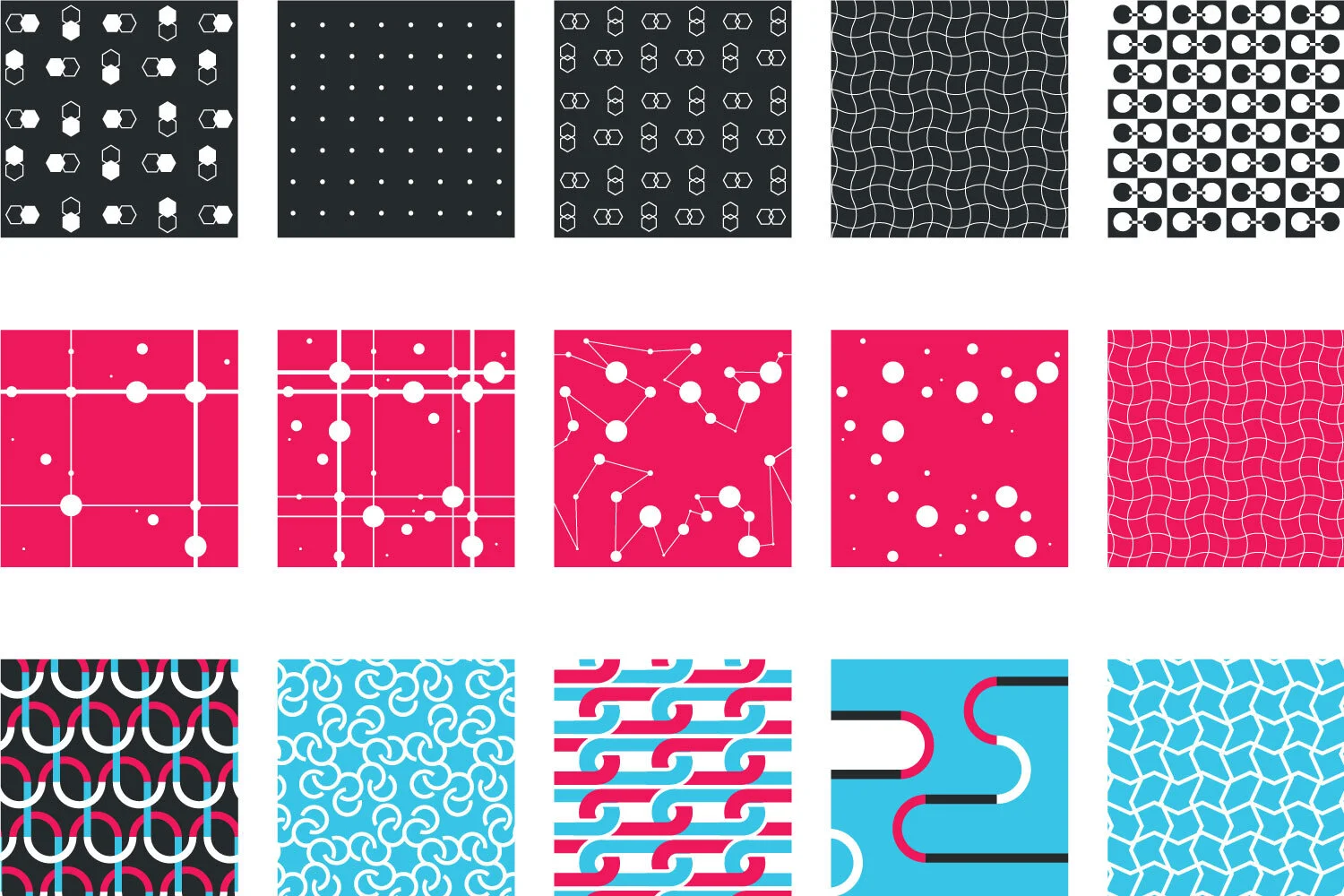
Connect patterns
Each pattern in the Connect concept signifies “connection” in various ways such as connecting dots, linking up, or curved puzzle pieces coming together. The Connect logo itself also reinforces this idea. Utilizing multiple patterns allowed for a more varied look across materials. The patterns could be used together or individually and still provide a cohesive branded look for the conference.

Connect conference swag ideas

Brochure and folder cover concepts
CONCEPT #2: Alliant Next
“Next” aimed to give conference goers a sense of Alliant as a modern, forward-thinking company.
This concept was built around the idea of moving towards the future and pushing the company into the next phase.

Next logo

Next design elements

Brochure cover concepts

Next conference collateral ideas

END RESULTS:
Ultimately the client chose the Connect theme, however they felt it was best to utilize their current brand colors instead of the proposed off-brand color palette.
Our team provided design for the conference’s presentations, signage, popup banners brochures, badges, lanyards, and other swag.
In addition, Magda Mucha created and animated my logo and patterns to create an intro video that played each time the conference reconvened after breaks.

Connect logo adjusted colors
Conference intro animation done by Magdalena Mucha
Team Members
Miles Matsumoto
Creative Director
Magdalena Mucha
Graphic Designer & Animator
